Fudu is a construction company from Tainan, Taiwan. They are well known for creating thoughtful and intelligent buildings with the very best material and technologies available. Unusual for this region of the world, their designs have a very humble and reduced esthetic, inspired by modern Japanese architecture. We have been helping them with the graphic side for a couple of their projects, starting from the fence for the construction sites, applications in the showrooms and a variety of printed items – just up until the buildings will be finished. For projects like Kado and Ho-i we have also been assisting with naming and copy writing for marketing materials.
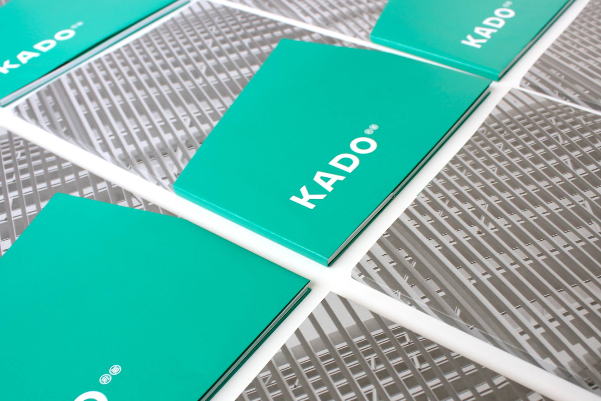
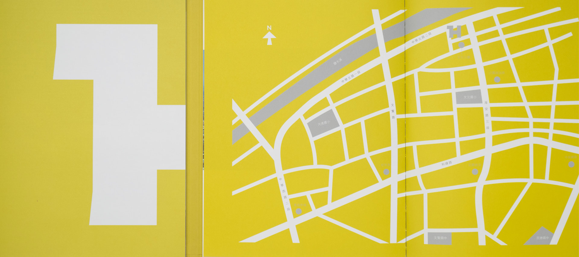
Often the shape of the architecture gives the best clues for the development of the visuals, for the Kado building for example, we used the distinctive shape of the penthouse for the lettering of the logotype to create a subtle link between visual identity and architecture. For Ho-i on the other hand it was the birds-eye view which gave the rather obvious solution with a shape that already looks like the letter H.
Often the shape of the architecture gives the best clues for the development of the visuals, for the Kado building for example, we used the distinctive shape of the penthouse for the lettering of the logotype to create a subtle link between visual identity and architecture. For Ho-i on the other hand it was the birds-eye view which gave the rather obvious solution with a shape that already looks like the letter H.
#naming