MANO MANO is famous for its macarons, which can even be ordered with custom-printed motives by customers.
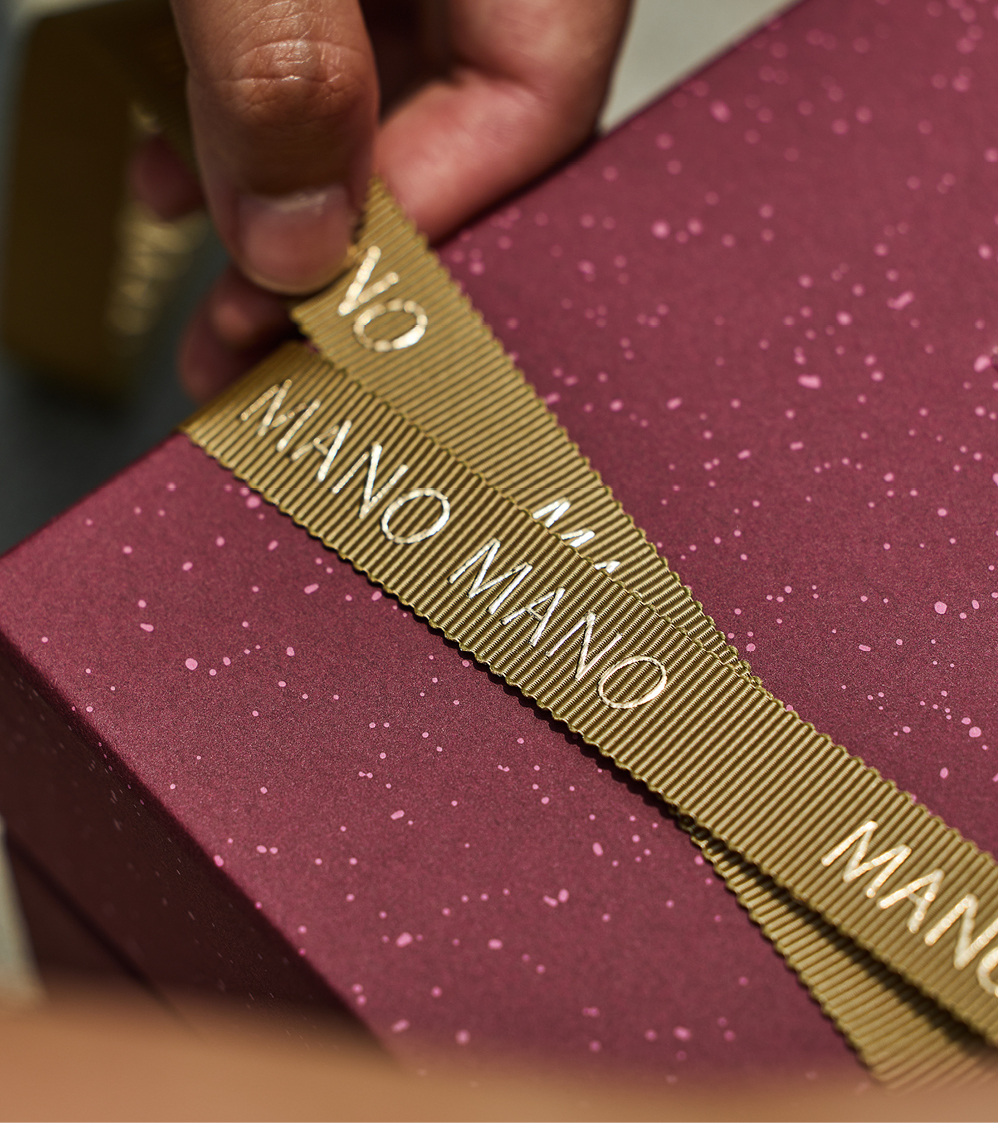
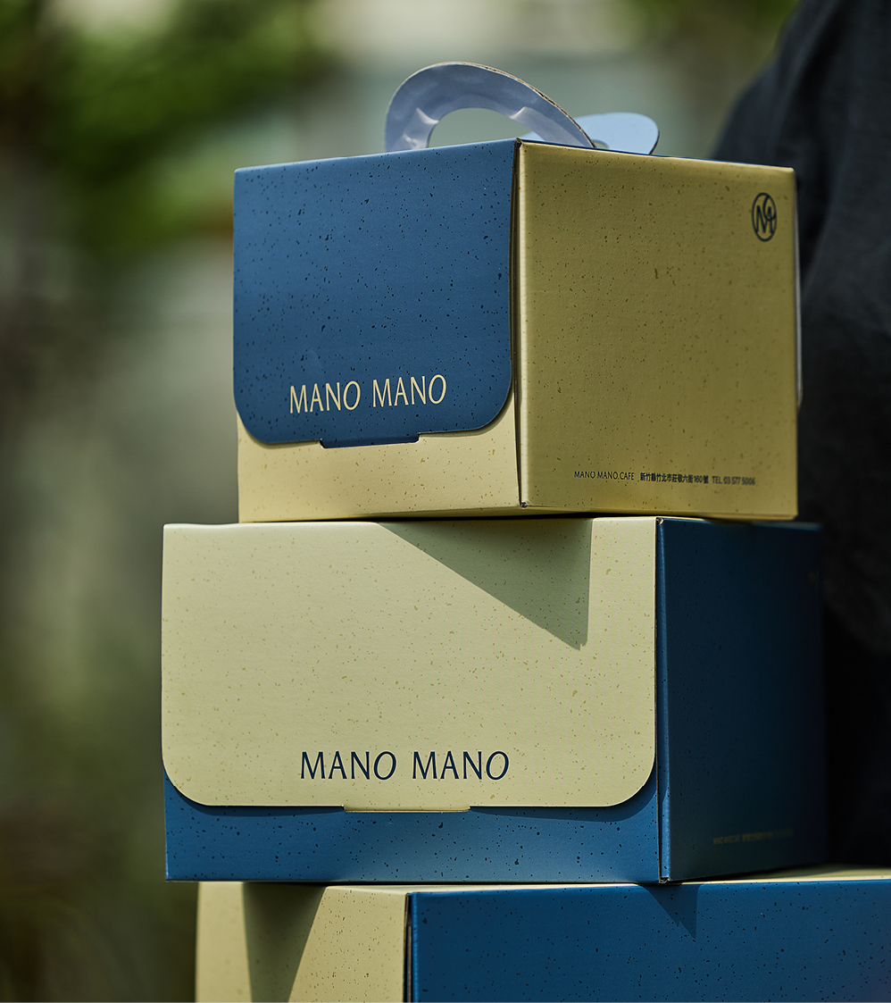
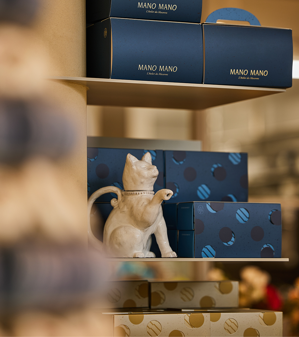
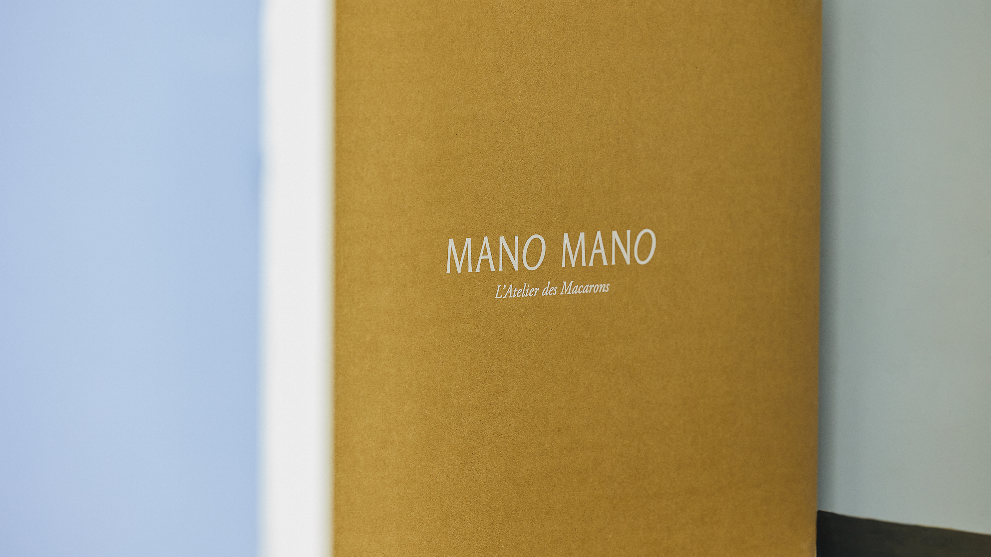
With success comes expansion and with branching out, a more extensive visual identity was required to set up the brand for a wide range of applications, mostly packagings and gift boxes. The design always centred around the hero item – the macarons, in a simple, yet playful typographic solution. The original colour palette has been given a refresh as well, with plenty of space and room to play for future applications.
The whole design was then launched for the occasion of a newly opened branch of Mano Mano. Working with the architects, the concept was extended into space for a wholesome and coherent brand experience.
Photography
by Lin Ko Cheng
by Lin Ko Cheng


