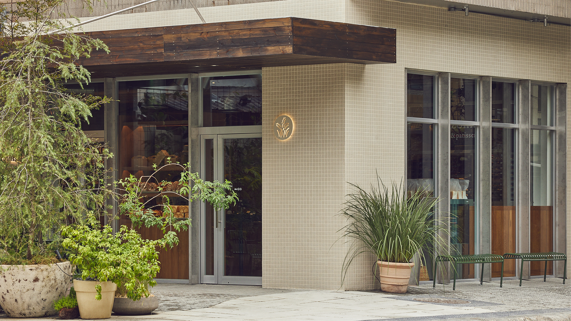
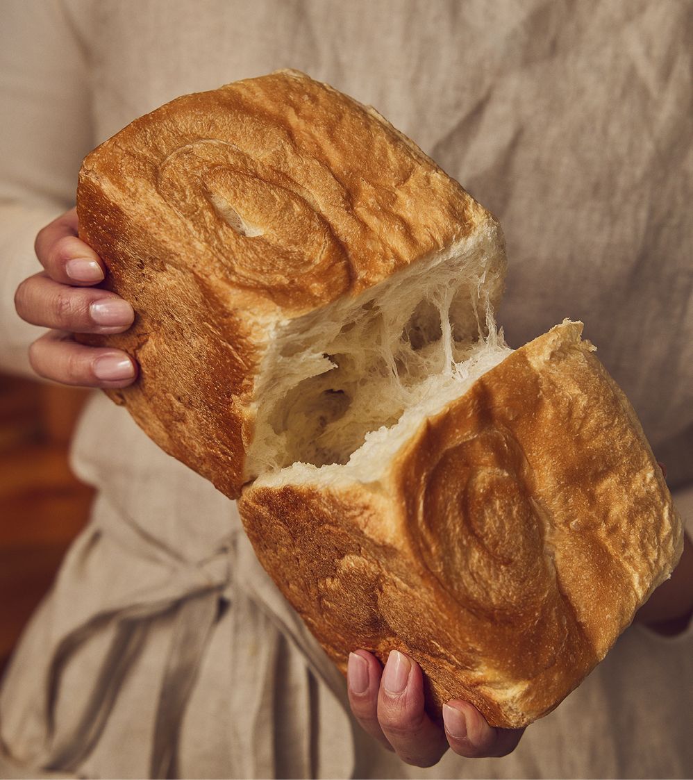
Nozomi is a bakery. The name means hope in Japanese, projecting the founders wish for a more sustainable and vegetarian way of living, inspired by his time in Japan. The aim is to implement this philosophy into people’s daily consumption as a neighbourhood bakery.
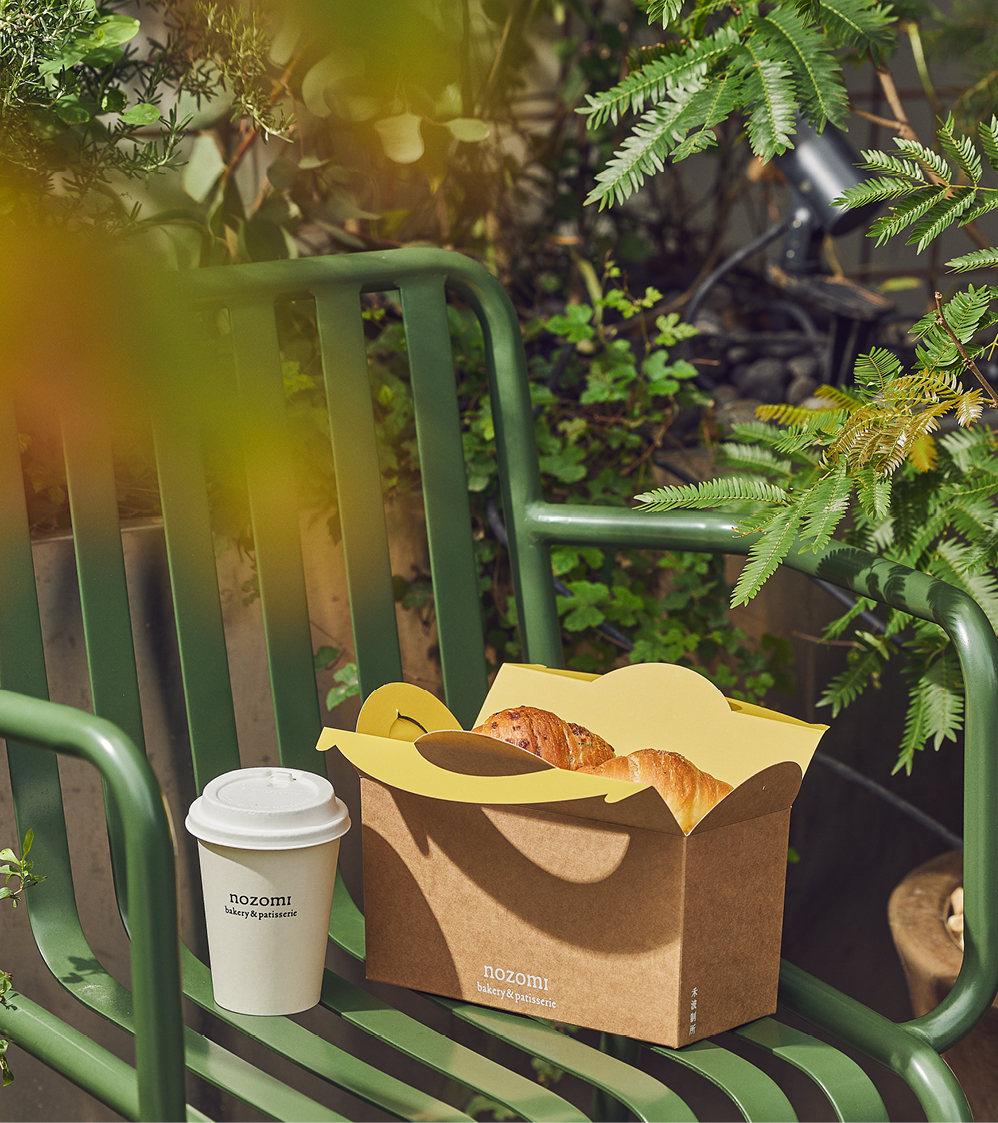
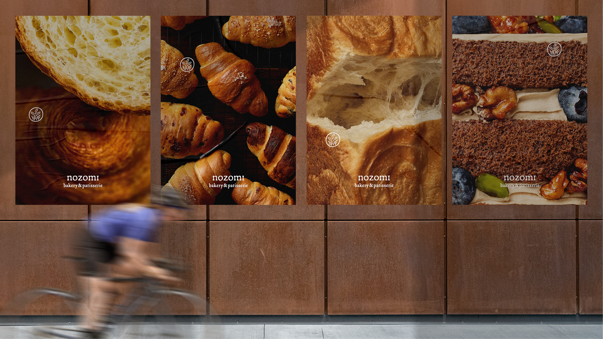
The logo acts just like a stamp of quality and approval, commonly found on food produce, inspiring confidence in the consumer in a friendly and warm way. The rounded angles are referencing the hand-made process of the baking, delivering a sense of warmth and anticipation; the matte grainy texture conveys the various rich natural products used.
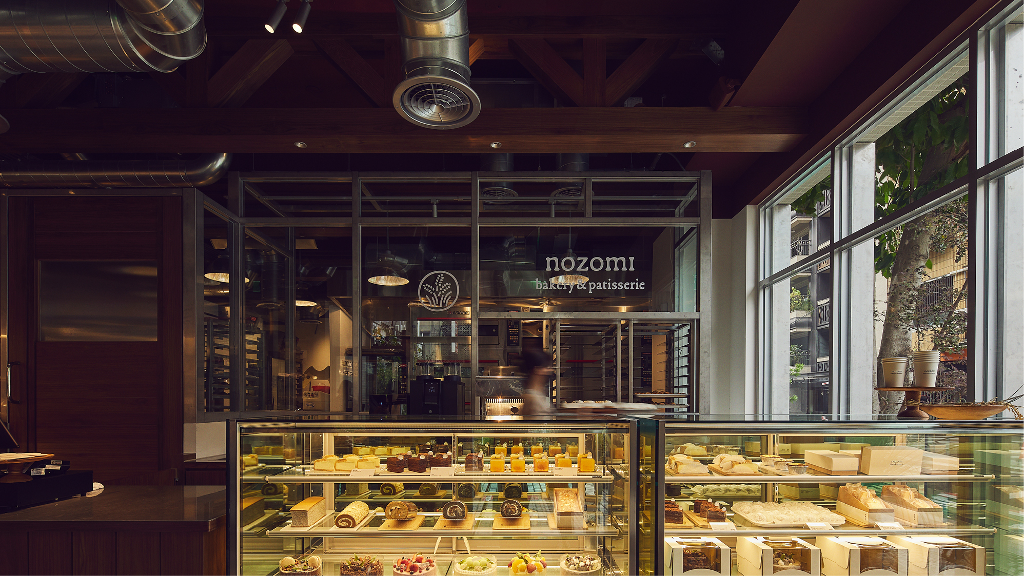
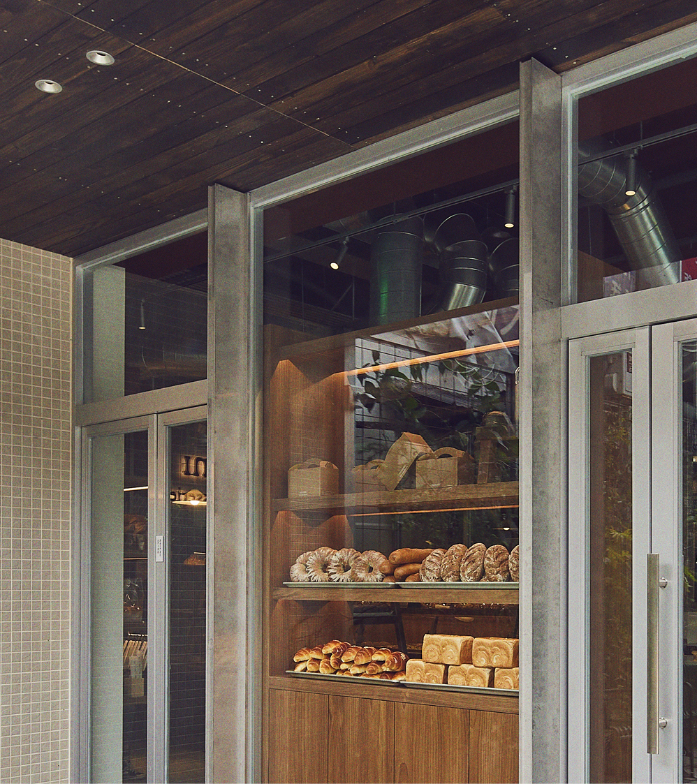
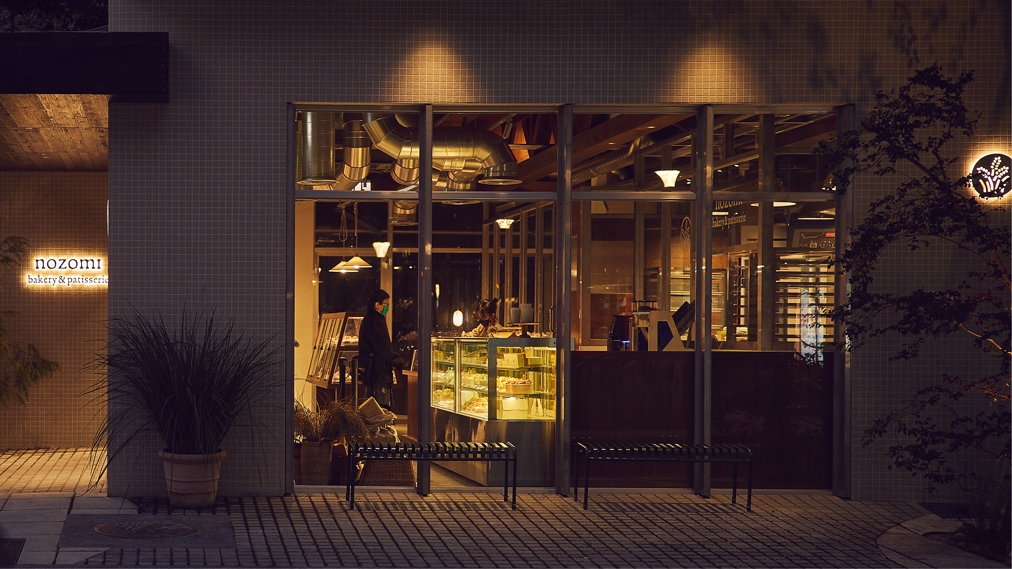
The art of baking requires the infusion of time, the assistance of temperature, air and handcraft. Just as considerate, the interior architects from JSC studio have created a detailed and organic space to complete the new Nozomi brand. The bakery becomes a little refuge where busy urbanites can slow down and take a bite to nourish their senses.
The logo acts just like a stamp of quality and approval, commonly found on food produce, inspiring confidence in the consumer in a friendly and warm way. The rounded angles are referencing the hand-made process of the baking, delivering a sense of warmth and anticipation; the matte grainy texture conveys the various rich natural products used.
The art of baking requires the infusion of time, the assistance of temperature, air and handcraft. Just as considerate, the interior architects from JSC studio have created a detailed and organic space to complete the new Nozomi brand. The bakery becomes a little refuge where busy urbanites can slow down and take a bite to nourish their senses.
Photography
by Lin Ko Cheng
by Lin Ko Cheng