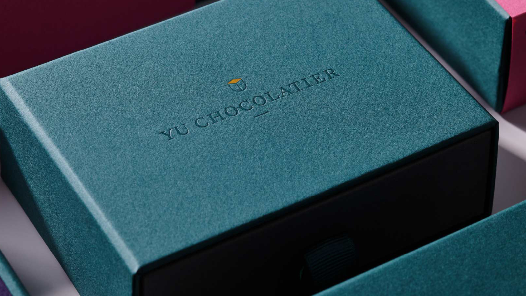
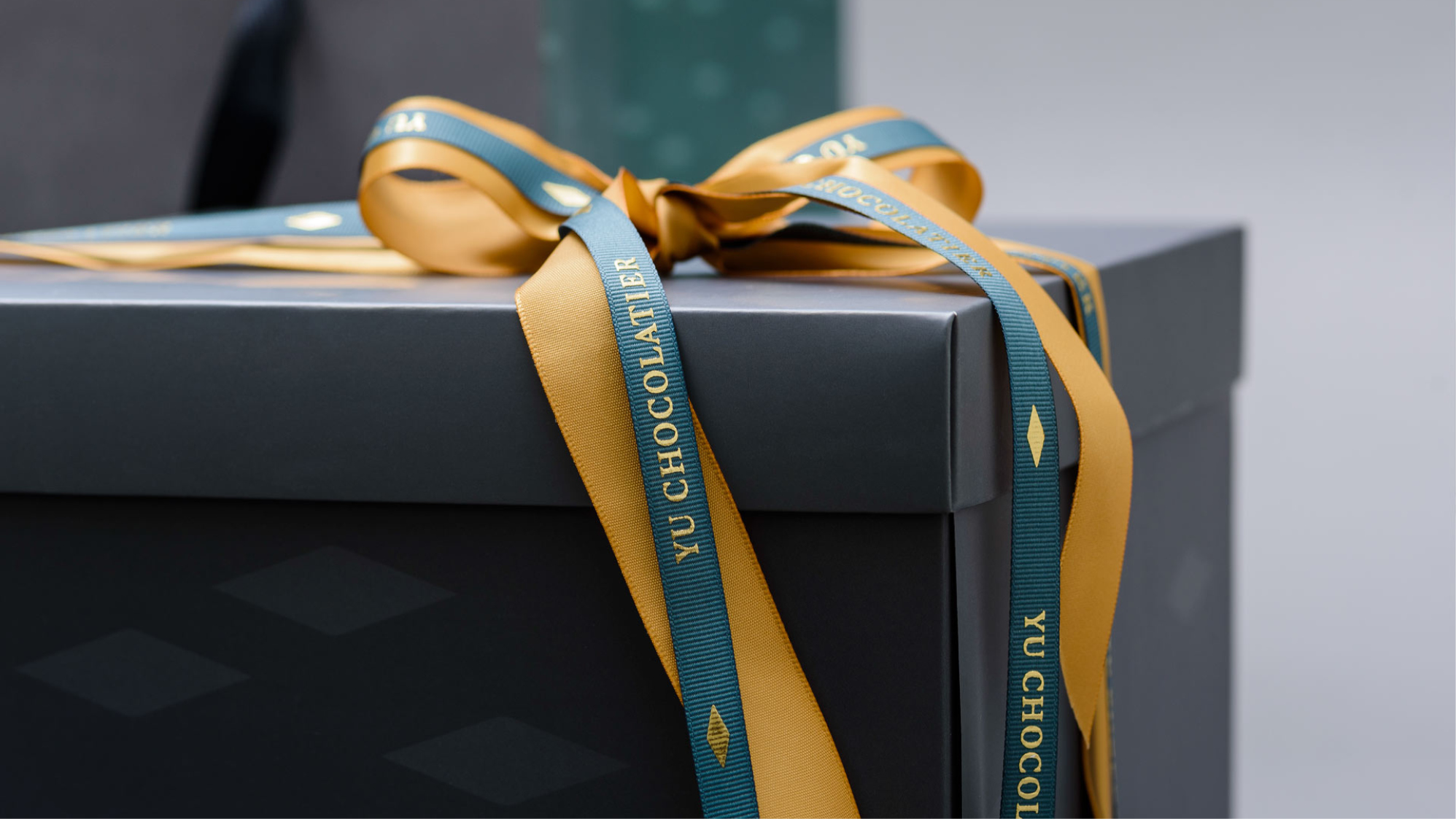
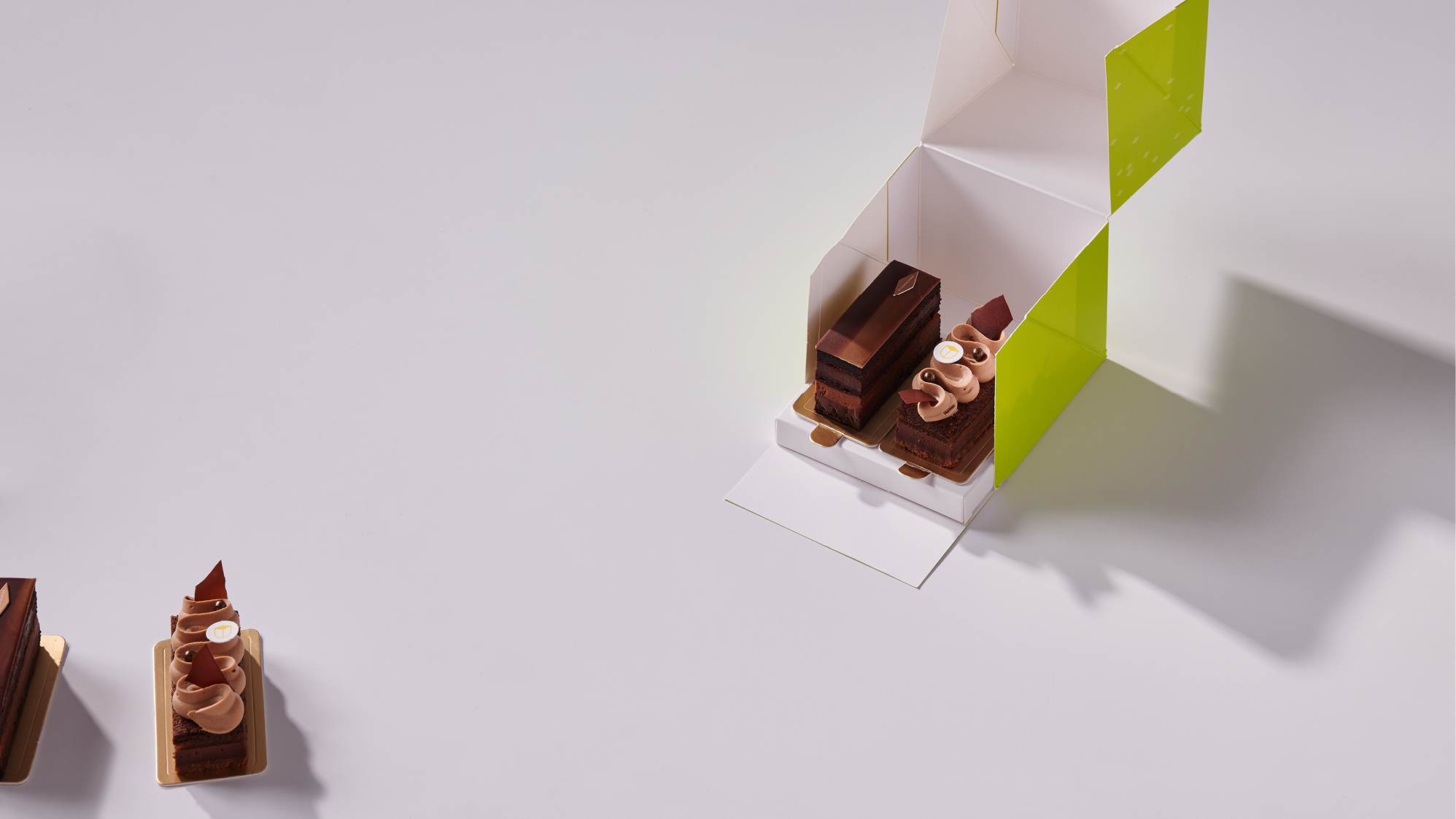
YU Chocolatier’s passion is chocolate. He is self-taught at first, then deepened his knowledge in Paris. His boutique shop in Taipei is now offering his gourmet chocolate specialties. Our goal was that the visual identity of the brand reflects and compliments the quality and elegance of his produce.
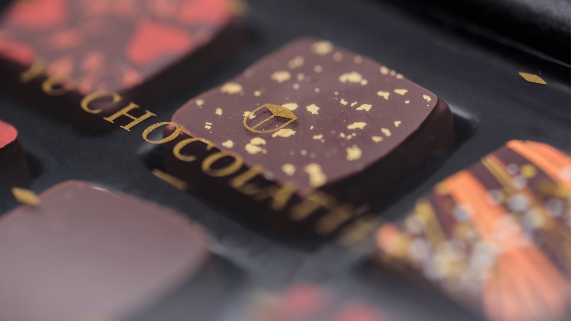
The main visual element of the brand is the golden diamond shape, created by the intersection of the YU-monogram. It symbolizes the appearance of his signature offering, the chocolate bonbon, as well as it is a subtle allusion to the meaning of the Chinese character for YU(畬). “A field in the mountains that has been nourished for three years, capable of growing any crop.”
The main visual element of the brand is the golden diamond shape, created by the intersection of the YU-monogram. It symbolizes the appearance of his signature offering, the chocolate bonbon, as well as it is a subtle allusion to the meaning of the Chinese character for YU(畬). “A field in the mountains that has been nourished for three years, capable of growing any crop.”
Photography by Andrew Kan,
Peacehome and BY
#le chocolat c’est
moi
Peacehome and BY
#le chocolat c’est
moi